Introduction & Challange
QOne is a fabric manufacturing company and has been in the business for 10+ years. They supply top-quality material to popular brands like H&M, Uniqlo, and many others. They wanted to set up a new D2C customer platform and sell their products, so they decided to design and manufacture on their own and sell it across marketplaces.
The challenge they faced was that they didn’t have an individual brand presence. They wanted to build a D2C brand that would attract customers to buy from them. Additionally, their website at the start of the project was neither attractive nor user-friendly. The selling website of any brand must be appealing and easy to use for the user. A company’s website plays an integral role in the brand image and sales of the business.
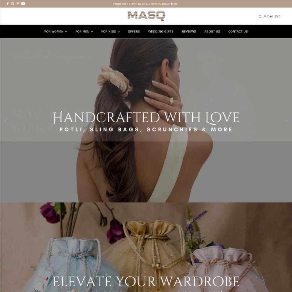
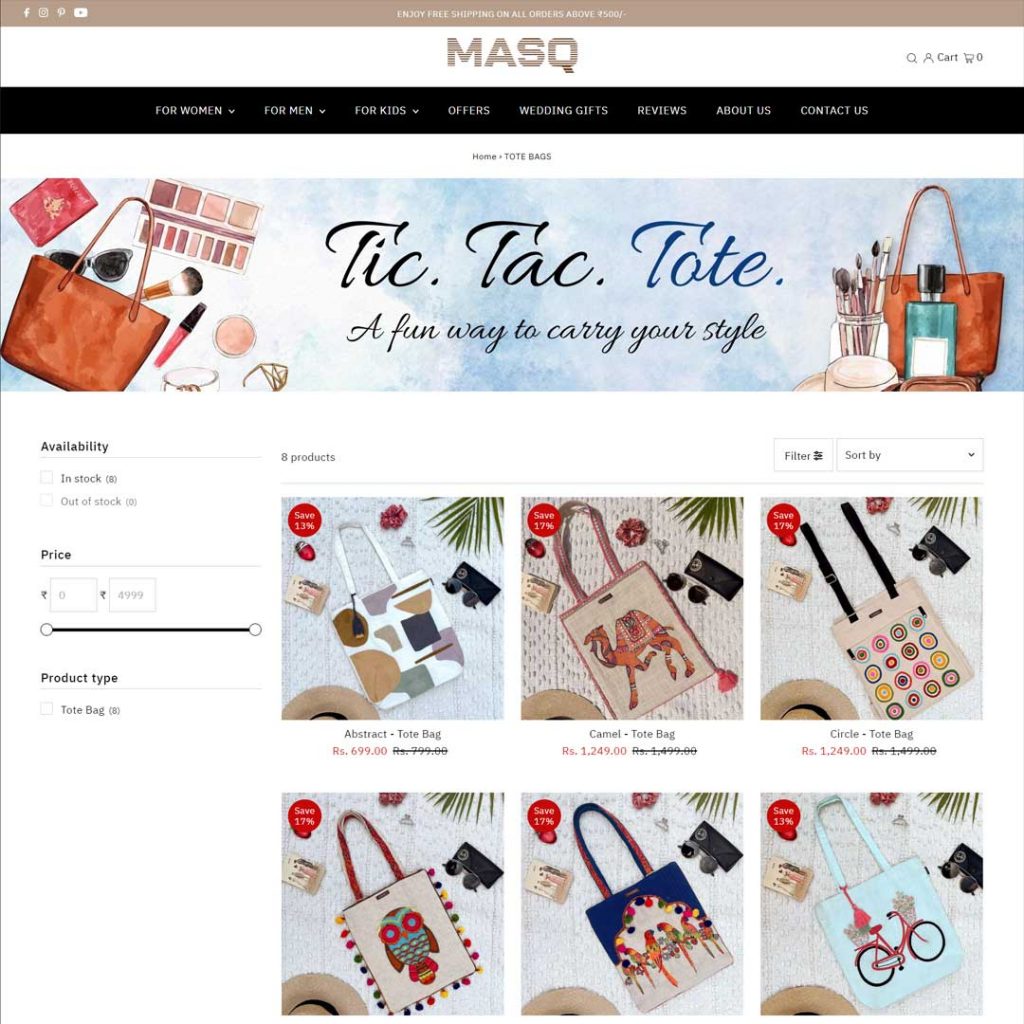
Firstly, we suggested they change the name from Qonekart.com(initial domain name) to Shopmasq.com as the original title could be confusing for the customers. On this advice, They purchased the domain- ‘shopmasq.com.’
Let’s see what team Qone has to say about us: “The most wonderful quality of BrandMe Out! is that they work with your brand like it’s their own. The extra effort that’s put in after hours, on weekends and whenever support is needed is commendable.Their knowledge in the subject field is top notch. Would highly recommend the agency if you’re looking for a one-stop solution for all your branding needs.”
BrandMe OUT did a competitive analysis for Shopmasq and formalized a strategy for them. We helped Qone to get its product concept right and build a powerful brand image. Their products targeted the masses with premium quality products at an affordable price but had challenges communicating the same. We helped them showcase themselves as a luxury brand by revamping their website and social media platform. BMO consulted Shopmasq on their Instagram and changed it to be visually appealing, organised, and user-friendly. Shopmasq has an A+ listing on Amazon with proper images of its product design and conceptualization. We have also built them a referral and loyalty program strategy so that they can make a community of loyal customers who get rewards when they purchase. Their website has aesthetic visuals and product images, so the model shoot also appears when you hover over them. We build their brand in such a way that their sales would increase.
We were called in the middle of the project to develop their brand. There is no doubt that the quality of the product matters the most while trying to sell something, but if you don’t have a brand, then you may not be able to expand after a certain point. We were glad to bridge this gap for MasQ and act as partners in building a compelling website and brand strategy for them.
Share:
Let's build your brand together!
Conceptualization of Graphics & Video | Content Strategy | Website Development | UI/UX Design | Brand Style Kit | Logo & Identity
Voice & Tone | Messaging & Positioning | Naming & Taglines | Packaging Design | Perceptual Mapping & Brand Perception
Brand Consultation | Storytelling | Brand Engagement strategy | Product Conceptualization | Community Management
Referral and Loyalty Programme | Channel Identification | Social Media Post Design | 2D Animation | Visiting Card Design
T-shirt Printing & Merchandise Design

